MORE ABOUT ME

Friday, March 30, 2012

POST BRUNCHING (AGAIN)

Hello everyone........this post is usually a Monday post......BUT.......
I wanted to share some photos I took after brunch last weekend.......
ENJOY!
BEHOLD! The world's largest cocktail strainer.

YUM! That is all I can say!!!!!

Yes. That is my finger in the shot.....
I am a little worried about the person that buys this suitcase of HORRORS!!

Edith: You know Ronnie, I have been looking for a big piece for behind the divan
Ronnie: I think I found it. Do you like boobies??

VVVRRRROOOOM!

I call this "hands on my seat".

I was surprised that there were "antique" hockey player travel mugs.
Am I the only one???

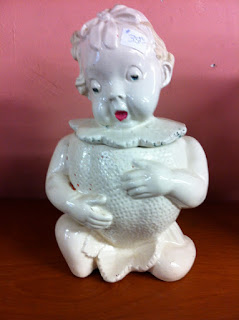
No antiquing day would be complete without a creepy doll.
You're welcome!

Not an antique........it's actually a cat bed.
I was a little weirded out by it!!!

"Lady Elite" is also my stage name.

COOL!
It's the original"Breakfaster" it is a little oven and a hot plate combined.
And also a fire hazzard!

"Slug Fest"..........
.......also what I like to call a Nickleback concert.

I love these!!

Ok.....is it my imagination....or is this a little Alfred Hitchcock-y??
Snow seems a little stressed by those birds!
 
Ah yes...the old creepy child-berry cookie jar.
The sure fire way to keep your kids from snacking! 

After I took this picture I was informed that this antique wasn't for sale.....
as much as it was for recording sales.

Lastly, I leave you with this.

Does this cat look happy to you???????
It looks like it is saying "b*tch, please"
So there you go....another productive Sunday!!!
Hope you enjoyed it.

Wednesday, March 28, 2012

WW:55- LAZY LADIES, CHAINLINK BEAUTY, AND MAC&CHEESE!

5 things I love this week!
Remember folks - if you ever have something that you think I should feature on my WW post - I love to hear from you!!!!!

1.) I love these vintage inspired travel posters for the lazy person! Created by Caldwell Tanner I think these are super clever:


2.)These writing pads from Tricky Notebooks are the best 6 bucks you will spend!!! LOVE THEM!!!


Cool huh??? Buy them online HERE!
(thanks to Design Boom for this one)

3.) Ok....so I totally HATE chain link fences........but look at THESE:


Lace Fence is a design of Dutch Design House Demakersvan. It is a high-end metal fabric that gives new insights in how you can create unique environments. It combines the ancient craft of lace making with the industrial chainlink fence. Every fence is unique in its design by its craft and assembled patterns, which come in a variety of themes. From antique lace floral to contemporary designs and custom art patterns. FANTASTIC STUFF!!!!!!!!!!!!!!!!!!!!!!


YOU MUST LOOK AT THIER OTHER DESIGNS AT http://www.lacefence.com/
(thanks to Beautiful Decay for this one!!)

4.) Do you like Mac and Cheese? C'mon. Be honest.....EVERYONE loves Mac and cheese!! Here is a recipe I stumbled on through Pinterest it looks deelish!!!


Go to www.tidymom.net for a better look at the recipe. And for more yummy dishes!!!!


5.) Do you like the t.v. show "Community"? If you do, this ridiculous teaser for the show will make PERFECT sense!!
OK!
That's it for another week!!!
I hope you enjoyed today's post!!!!!!
Later Gaters!
~R

Monday, March 26, 2012

SPRING HAS SPRUNG

Hideeho All!
So, I know what you are thinking......ROB.......we haven't seen any new work from you for WEEKS!
Well, it doesn't mean that I haven't been doing anything.
HOW DARE YOU! Catching up on Ellen is VERy taxing!
;-)
So, I am part of a group show that is celebrating spring.
It is at MJG Gallery. Located in the heart of Cabbagetown, (555 Parliament St - Just south of Wellesley)

It's a fairly new gallery...and is owed by Mark Gleberzon.
It is a really nice space and Mark is great!
Here is his gallery facebook page.....and his site!

I don't have all the deets yet.....but it is a Spring theme. With lots of different artists!
Here is one of my BRAND NEW submissions:
"Hope Springs Eternal". 11" x 14", Acrylic and Ink on Mixed media.
So, let me break this one down for you.
I stained the wood on the left and painted on the word "Hope".
The middle has a series of springs.
The final part is a heat transfer of an older (sold) painting.
I then added ink and paint on top to make it look complete.

Here is the SECOND one I did for the show:
"No Spring Chicken", 11" x 14", Acrylic and Ink on Mixed media. 
So, on this one.....
I painted a green background and applied two letters "N and O" (then I painted on top of them to colour correct them) The middle has a huge spring with 2 pieces of stock holding it.
I painted a chicken one the wood on the right.
I attached a couple of chickens (one black wooden - hand painted piece) and a rubber one (top right)
The final part is a heat transfer of a tin toy chicken from another old painting (sold) "Cock-Up"
I then added ink and paint washes on top to make it look complete.

So whadda ya think????
I will post all the details and an invite by the end of the week!!
Have a great one!!!

Wednesday, March 21, 2012

WW:54 - DARK SHADOWS, "FORDMANIA!", AND WORK STRETCHES

Okay. So here are 5 thing sI love this week......

1.) Tim Burton's 'Dark Shadows'. Based on the campy classic 'gothic soap opera' that originally aired on television from 1966-1971. It reminds me of the good old 'Beetlejuice' days!! I love me some Johnny Depp and also cannot say not to Michelle Pfeiffer. I know I am a week late posting this for many of you....but for those of you who have been living under a rock and have missed the preview trailer.......here you go:

2.)Awesome matchbooks! I LOVE these!!! Artist Krista Charles creates small graphite drawings on matchbooks depicting screen grabs from Google Street View based on the exact Google Map location listed on the matchbooks. Krista creates these drawings as a way to document the consequences of urban development over time. She explains: "Sometimes the places advertised on the matchbooks are still in business even after decades have passed, some businesses have changed names and are under new ownership, and some buildings are empty or have been torn down and replaced by new buildings or parking lots or highway expansion programs and even empty fields."


 Find out more about the project here or visit her Etsy shop to purchase the matchbooks.


(thanks to Junk Culture for this one!!)


3.) The Fordmania! Art Show at Atomic Robot. Come out and support a great little shop in Leslieville, and enjoy the art show that runs through April 23rd. There are 30 or so pieces, including illustrations, paintings and a work constructed from empty pizza boxes.  All of the pieces are for sale, but one of the best pieces is this one by my friend Cindy Scaife
You have a month or so to check out the exhibition at the store:

4.) As many of you know, the recipes at the Kraft site/magazine are not unlike crack. Full of temptation, completely addictive....and basically BAD for you. BUT when my friend Christina bakes...you just can't say no! Here is what she made last week.....that was a MUST TRY!!! 
Banana and PB Snacking Cake = YUM!!!!!!! 
please note.......she added the decadent chocolate chips to their recipe to kick it up a notch!!!
YUMMERS!!!!


5.) I leave you with something you might get a laugh out of.....but that could also EDUCATE you in the art of stretching!! Enjoy these stretches you can do at your desk........


BEWARE.....this may not be kid friendly.....


**courtesy of pleated-jeans.com


Monday, March 19, 2012

JOIN THE LIGHT RAIL REVOLUTION!!!!!

My newest painting is rather timely in Toronto.
If you live here, you already know that there is a big hubbub about the Toronto Transit Commission......and our Mayor. I won't mention his name......or his policies........because, quite frankly, I don't agree with him...on ANYTHING.....EEEEEEVVVVVEEEEERR.
Here is a diagram that outlines the issue...one is the mayors plan....the other is the plan that was approved like 5 years ago....

So as you can see......it is kinda obvious what is better for the city.
I will say NOTHING more......
Like my Momma says..."If you don't have anything nice to say........."
So I painted this painting:

"Energy Plan", Acrylic on Canvas, 24" x 24"
What do you think?
What do you think about the new light rail proposal??
I'd love to hear!!
Later!!!

Wednesday, March 14, 2012

WW:53 - TRAILERS, COMMERCIALS AND SHORT FILMS!!!

This week's blog is blatant commercialism!!!
But.....I like al these......and it MY blog......so here we go!!

1.) You know how I love Pixar.........well here is a 1-2 Pixar punch! I love these 'minimalist' posters for the movies!


Australian designer Wonchan Lee has taken some of Pixar's most iconic characters, from some of the most popular movies of the last few decades, and stripped them down to their most base elements. What is fun is actually trying to guess which film each poster design represents which film... buy prints here.

Lee told MyModernMet: "Turning the most realistic 3D animation into the simplest vector graphic... Everybody loves Pixar, which means you wouldn't want to do anything to let them down. Because it has really broad demographics, in terms of age bracket and cultural background, it was very challenging to come up with something that pleases such a wide audience whilst satisfying myself as an artist and as a fan of Pixar, too."

(taken from Juxtapose blog - via Cindy!!)

2.) BRAVE. Pixar's take on a 'Disney Princess' story. Can't wait to see it!!!

3.) Ok...not to be all media all the time...but this ad for The Guardian (in London) is AMAZING!!!!


4.) Ok...it is officially ALL MEDIA day.......I love these short videos......The first one is called " Western Spaghetti" the second is called "Fresh Guacamole" and the third is called "The Deep" - all by director PEZ  These video is being featured as part of Showtime’s Short Stories series!


COOL HUH?????

5.) Since I am on a YOUTUBE roll......here is something I liked......this is for Cindy!!


Hope you are all media'ed out!!!!!
I am!