MORE ABOUT ME

Friday, October 29, 2010

GARAGE SALE

Finally I have finished my one commission. WHEW.
So as a refresher, this is the story:
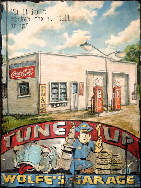
The commission is based on the former "Wolfe Garage/Service Station", which was owned by my client's father. I had one little photo reference from it's heyday in the early 50's:


To keep it authentic, I had to do a BUNCH of research. What kind of gas? What do those signs say?
What colour was the building/pumps/etc. It was a fun process!
I also had reference detailing what the building looks like today (as its current incarnation "The Lakeside Garage"). 


AS you can see, it is COMPLETELY different!
So, from this I made a drawing and tried to make it more dynamic of a composition. It was a great challenge!! Here is the process and the final product. Enjoy!
In the beginning, there is the plan....the pencil and the prayer that it will look good.
The 3 P's!
This is about halfway. I complete the top before the bottom.
At this point, I was waiting for client approval on the bottom imagery.

Here is my initial rendering for the bottom (the vintage part). As you can see it is pretty rough looking...
(it is my computer rendering)
HUGE DIFFERENCE, HUH? This is at the almost done stage.
As you can see I changed a bunch of the bottom imagery I think it works much better here!!

TAA  DAA!!!!


What do you think of the final product!?

Wednesday, October 27, 2010

CHRISTMAS COMES EARLY

It is time for another blog entry about one of my many vacations.....
Here are some pictures from Bronners.
For those of you who have never traveled to Frankemuth (Michigan's Little Bavaria) you have missed out!!! The little town is SUPER CUTE. And just outside the town is the largest Christmas store in the world. Bronner's operates year-round, the building is 7.35 acres (29,700 m²) in size with landscaped grounds covering 27 acres (109,000 m²). Outside the entrance are three 17-foot (5 m) tall outdoor Santas and a 15-foot (5 m) tall snowman. Inside, there are approximately 800 animated figurines at various locations throughout the store. Some 100,000 lights illuminate Bronner's half-mile (800 m) long Christmas Lane in the evening. Michigan designated Bronner's as an "Embassy for Michigan Tourism" in 1976. Bronner's employs over 500 people during the holiday season (between October and Christmas). Fun facts? Bronner's electrical bill averages US$900 per day! If all the light sets sold in one year at Bronner's were stretched out in a continuous line, they would span approximately 530 miles (850 km). THAT IS A LOT OF LIGHTS!!

Bronners..........putting the CHRIST in Christmas!
Balls, balls, balls.
A good game for the kids......count the Santas.

At the half way point it is sensory overload!


Christmas Circus. LOVE IT!

**Not life sized

Nothing brings children together like Micheal Jackson,
Sorry. That is terrible!


This house (which was life sized) was priced near $22,000!!!

Monday, October 25, 2010

THE ODDITIES AND INSPIRATION OF MICHIGAN

Hey all!
I know what you are thinking. ANOTHER VACATION???
Times are good for you, Rob Croxford.
It's true! Things are great.
Even if they weren't great - there is nothing like inexpensive shoes to make life great!
There. I said it!
Anyways, a couple of times a year we like to take a trip to a border city for a little shop-spree.
Usually we go to beautiful Buffalo. But this time, we went to Marvellous Michigan.
We spent 3 days in Birch Run which is near Frankenmuth/Saginaw/Flint.
Then we went up to Mount Pleasant (to the big Soaring Eagle Casino)
Finally we went to the Pontiac area to the Great Lakes Crossing.
Here are some strange and wonderful things that I saw in my week away!

Who says size isn't everything?
You know what they say "the bigger the sign....."

I think these birds are spelling "Buy some more shoes, Rob"


This was crazy - they documented the evolution of the hotel we stayed at from 1959-today!
I LOVE the retro signs in the first two pictures!


I just love me some neon!!


Hello Big Boy.


This was posted in the hotel pool.
It is both amusing and cool. 


Yes, that is one gallon of chilli.
Another reason I do not want to go hunting! 
I am just dying to learn to be fancy....
......like Nancy.


Peanut butter chocolate fudge cake.
NOW THAT IS INSPIRING!!


This sign was great. I thought it was quite clever!


The new merchandiser at Target is super gay!
I like how each of these men is described...
though I have no idea if bootcut is an insult or not??
(Thanks David for that joke!)

Thursday, October 21, 2010

COMMISSION-ER

Ok, so....here's what I am working on RIGHT NOW.......
I am almost finished with this commission based on a gas station n Port Burwell.
I am gonna have a step by step of how if got made next week. As well as a photo of the final painting!!! But here it is now....

The top "landscape" part is almost done, now to work on the 'retro' bottom part. The bottom will be painted on metal and then applied to the piece with rivets!


Also, I have begun my commission all about The Beach.
(The Beach - aka The Beaches)
It is not nearly as done as the one above. But it will get there in its time!!
I will post more pictures from this one next week too!! 
Once I put all my effort into it, the piece will hopefully done by the end of the month!!
Then I just have one last commission to do, and I will then, finally begin the work for my show in March of 2011!!


Tuesday, October 19, 2010

COLOUR FOR DUMMIES

Ok, today only a short post.
You know how people are always trying to match their art to the room?
C'mon. You know you do it!! I DO IT!
But what, and now hold on to your hats folks, if you matched your room to your art?!?
CRAZY, I know, but seriously why not??
Now, not everyone is super-dooper with colour, and is not able to see what colours match.
I have to solution.
Ok, actually it is not me, the solution is from KULER

At Kuler, you play with colour. For example, let's say you wanted to decorate your room around this painting:


("Out of this World", 48" x 36") which incidentally is available for purchase in Ottawa at Terrence Robert Gallery, has a bunch of colours you could choose.
All you have to do is import the JPG into Kuler and whamo-blamo....instant choices.....
It will give you a range of colours that you could choose based of a few 'moods'.
I plugged it in and here are the results:


This is the MUTED mood...... 
This is the COLOURFUL mood...although it doesn't really do it for me!
This is the BRIGHT mood, which I like a lot. Lots of variation in it!
Or, if you just none of the moods fits YOUR mood, you can make a custom palette. 

 So, there you go. A stroke of brilliance!
There are lots of other options to create your own colour scheme on this site, and hundreds of already built schemes that could help you too. I encourage you to check it out!!

Saturday, October 16, 2010

VACATION...ALL I EVER WANTED....

VACATION....HAVE TO GET AWAY.
That was a little 'Go-go's for you! I am probably dating myself with that reference.....hmmmm..
I am keeping this short today, as I am off on vacation and I do not want you to miss me.
I still care. 
But, I will be doing a little cross-boarder shopping. Mama needs some new shoes.
As a kick off to my vacation, I saw "Priscilla Queen of the Desert" Musical last night here in Toronto.
It was super fun and more than that it was total eye candy.
I am not gonna show you the scenery - I don't want to spoil it for you, but since I have nothing new to report in my own work, I am attaching a few photos from last nights show.
The costuming was INSPIRATIONAL (for me) - and I will probably file the pictures for reference...
Just get a load of the COLOUR!!!!!!!
WOW!!!
Here you go poppits...enjoy:


Thursday, October 14, 2010

LEARNING THE HARD WAY!

Gather 'round children, it is story time!
I know you love a good yarn! Actually I think a yarn is another word for tall tale.....so it is not so much a yarn as it is a True Hollywood Story. (and by Hollywood I mean, Toronto)
So, earlier this week I posted about this piece:


and I promised the long and sorted story. So here it goes.
Many moons ago, I was approached by a poster company, let's call them Screw-You-International. (the name has been changed to avoid further incidents.) So, Screw-You-I just loved my work. It was 'fresh and new" and they had never seen work like mine before. So it was nice to hear that at the beginning of my career. So we had a bunch of meetings. It was decided that I would do a series of SIX paintings for them that they would turn into posters. It was so exciting! They really laid it on thick. I was told that I would get an advance on sales, and then after I made that back, I would get 10 cents on each poster sold! It sounded great because another artist was there the day I signed my contract, and she was picking up a $5000 check from them. WOW! That could be me! So then the design began. So I started doing drawings...lot s and lot s and lots and lots and lots of drawings. Soon after, I was given a palette of colour to use. I was not impressed. I mean that is some SERIOUS ART DIRECTION. To make it worse, the colours were all jewel tones. They were the colours that their big sellers stuck to. So, I followed!
MISTAKE #1. When you are forced to use ONLY the colours that are not in your regular palette, the result is often disaster!!
MISTAKE #2: I kept sending works with quotes that spoke to me. BUT they were considered to 'risque' for them. The end result was totally lobotomizing my work. ACK!
MISTAKE #3: Once I finally finished the work, I was not pleased with how they looked. They were stiff and lifeless. It made me mad to look at them. But we moved ahead and I got paid. One might think that would be the end of the story, alas, no.
A few months later, I called them to see how sales were. They were not good! In fact they were abysmal.
In the proceeding months I would get these monthly sales sheets. Each month they would track the sales and subtract the sales from my advance. 10 cents at a time.......for months and months and months. A couple years in, I called and was told that I still owed them over $700!!!! Needless to say, I stopped calling. It was really hard on my delicate ego!!!
What made matters worse? When I googled my name I found 16, count them SIXTEEN websites, all selling those posters. It should be good news, but they were selling my poster as a 'print' for $30-$300......depending if they were framed.....and I saw only 10 cents of that money! BRUTAL!!! And to add salt in the wound, I saw my work at Walmart. Which does not bode well for my cache as an artist. It kinda is not good news to be a Walmart artist. (It may have been less offensive, if I made nay money from it.....alas!)
The worst part is that to this day, when googled, those terrible posters come up for pages and pages and pages!! And when you are not happy with what they look like, it is not good news!
So that is the story. Boo.
Here are the paintings:


What do you think of them??